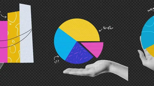
Visual hints enable immediate understanding. Therefore, converting tabulated data into histograms, pie charts, scatter plots, or color-coded geometric figures is simple yet effective for conveying complex ideas. Today’s technology also allows for 3D as well as animated dashboards to depict events. And this post explores the real purpose and scope of data visualization.
What is Data Visualization?
Data visualization transforms structured and unstructured data into flexible dashboards that precisely demonstrate fluctuations across specified metrics, like time, progress indicators, and resource consumption. For instance, a company can leverage data visualization services to study sales patterns, product popularity, or marketing campaigns’ performance.
Ensuring that visualized reporting describes the relative differences between recorded observations is vital to avoiding miscommunication. And enterprises often develop or purchase appropriate application software, cloud-based visualization facilities, and customizable application programming interfaces (APIs) for interactive reports.
Besides, they determine a document standardization policy. Doing so increases consistency across reporting activities, like how favorable and unfavorable outcomes appear in drafts. By utilizing automated visualization tools, brands reduce the time spent on report-generation tasks.
What is the Real Purpose of Data Visualization?
Effective communication is integral to modern storytelling, technical presentations, and sales pitching. Frequently, corporate meetings involve extensive number-crunching, but only a few participants grasp the crux of the message being discussed.
This situation worsens if the content involves domain-specific terminology or suffers from information overload. Reputed data strategy consulting solutions also recommend prioritizing clear, concise, and easily understood vocabulary throughout corporate communication practices.
As such, an ideal visualized storytelling approach serves the following objectives closely intertwined with the contemporary requirements of multidisciplinary conversations.
Goal #1: To Bypass Number-Crunching and Skimming
Tabulated data can work well in several workbook software or database management systems (DBMS). While sorting the records using mathematically-defined constraints can assist leaders in pattern detection, it can result in unnecessary number-crunching. Furthermore, the involved professionals might navigate the records through skimming instead of deliberately looking for irregularities.
Visualization of data allows for efficient single-view dashboards that render these undesirable behaviors irrelevant. Instead of straining eyes to find eureka moments in multiple database entries, a more user-friendly diagram will highlight the most significant data trends. No number-crunching is required.
Goal #2: To Facilitate Quick Knowledge Transfer
Sketches, drawings, diagrams, charts, and multimedia resources have empowered most educational and skill development institutions worldwide. Throughout history, humans have gone to great lengths to preserve what they knew for younger individuals to improve their knowledge base.
Today’s achievements of modern society are a cumulative inheritance of humans sharing their insights through glyphs, crypts, stone carvings, scrolls, papers, and digital formats. We are hardwired for these means of knowledge transfer that rely upon our visual and auditory senses.
A prominent purpose of data visualization is to embrace this aspect of cognitive development, employing it to break down complex workflows into digestible “flow charts” and “tree diagrams.” It becomes more impactful when sharpening technical skillsets among young recruits and explaining to clients what they will get from a deal.
Goal #3: To Identify Conflicts and Inconsistencies
What is easier between the following activities?
-
Finding an empty cell in a vast space of data fields,
-
Noticing a sudden gap in a curvilinear graph.
Like data unavailability, conflict detection is critical across engineering, management, medicine, governance, and legal systems. After all, in addition to the data quality concerns like missing or “null” values, conflicts can arise due to legacy records being incompatible with the latest data processing systems.
From a legal and governance perspective, a decades-old directive or guideline can affect a new policy’s effectiveness. Likewise, an ergonomics specialist might notice usability and accessibility compliance issues in a product’s design revision plans. Some conventional means of mitigating these risks include the following:
-
Color-coding documentation sections that are likely to require updates,
-
Examining designs and project schedules in light of regulatory revisions,
-
And assigning multiple approval stages per decision before implementing it.
However, an advanced data visualization dashboard can automatically highlight and report problematic areas using natural language generation (NGL) models. So, organizations can invest in custom solutions to get alerts on underperforming assets. They will gain insights into irregular hikes or dips in performance metrics alongside design and scheduling issues.
Conclusion
You have learned how data visualization serves the purpose of effective, inclusive, user-friendly, and practical exchange of ideas. Some applications will focus on transforming your marketing materials through high-precision infographics, while others with assist you in conflict resolution.
Data visualization systems also facilitate streamlined teaching-learning environments. They have completely eliminated the need for number-crunching, manual quality inspection, and reports containing extensively tabulated records. Moreover, integrating them to extract business-critical insights from your corporate intelligence assets is more straightforward than ever.


